Portfolio
I have been the primary UX/interaction designer on over a dozen digital design projects, and front-end developer on 40+ websites and web applications. Clients I've worked with include Allstate, Kaplan, YMCA, Chicago Children's Choir, The Joffrey Ballet, and School of Rock.
Some Projects I've Worked On
- Allstate Digital Locker, part of the Allstate Mobile App (with Punchkick Interactive)
UX/UI design and architecture for a ground-up rebuild of a consumer-facing mobile product for iOS and Android
Tools: Sketch, Balsamiq, InVision - The Riveter Website and Apps
Wordpress with fully custom theme and components, front-end development, cross-platform design system
Tools: Sketch, Figma, Wordpress, Vue, webpack - CureAccelerator community platform (with Mightybytes)
UX, component design, information architecture, front-end development
Tools: Balsamiq, OmniGraffle, Laravel, Blade - Greater Public Website and Resource Library (with Mightybytes)
User research, component system design, front-end development
Tools: Balsamiq, Wordpress
Case Studies
Allstate Digital Locker
- Client:
- Allstate
- What I Did:
- UX/UI Design
- Tools:
- Sketch, Balsamiq, InVision
Digital Locker is Allstate’s consumer-facing home inventory solution, which it uses to complement its property insurance offerings. The product was formerly a standalone iOS and Android app. Allstate customers used the app to inventory items in their home and organize them by room, in order to be prepared for any future claims process when dealing with property loss.
Allstate wanted to integrate Digital Locker into its Allstate Mobile app, as part of a drive to consolidate all of its disparate apps under a single umbrella. This gave them the opportunity to rebuild the Digital Locker product from the ground-up, and make much-needed improvements. I was placed on a small team and tasked with building the new UX, with the goals of increased user adoption and continued usage.
Allstate and Punchkick had already done user research on its existing product, so they knew the pain points they wanted to address. Their users found the existing interface to be daunting and unclear, and many abandoned the product after an initial try-out. Additionally, they were often unsure of how the app related to their property insurance and the claims process.
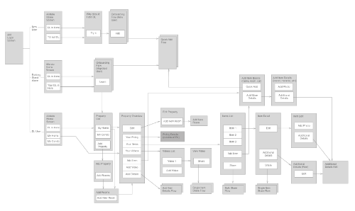
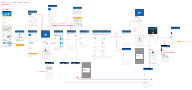
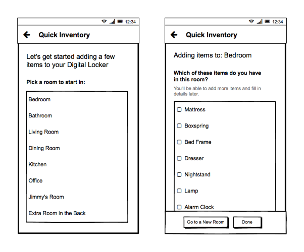
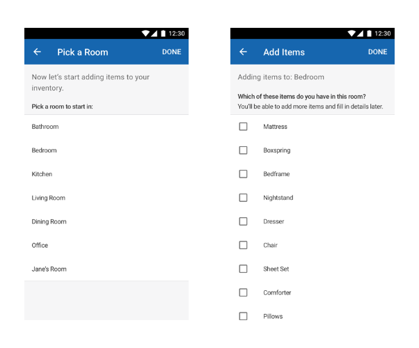
I was able to use this research, combined with customer data provided by Allstate’s claims department, to simplify the user process flow as well as create a “Quick Inventory” feature that would assist new users in adding rooms and items with as little friction as possible. Restructuring the user flow added more flexibility to the process of adding items to the inventory, to account for differing mental models. I carefully redesigned each screen in order to simplify the process and not overwhelm users, while providing clarity, context, and motivational cues along the way.
We used my prototype designs to conduct user testing, in order to help validate assumptions and steer the design through multiple iterations. I then refined the designs with Allstate’s visual design team to align to their branding and iOS and Android interface standards.
Once the product was fully integrated into the Allstate Mobile app, the user analytics data after 13 weeks was very encouraging:
- In prior versions, 85% of users had zero items added to their inventory. This number was reduced to 24% in the new version.
- In prior versions, in users that had at least one item added, only 15% of those users had more than 25 items. In the new version, 44% of users with at least one item had added over 30 items.
Allstate Digital Locker can be found within the Allstate Mobile app, available to Allstate customers.
CureAccelerator
- Client:
- Cures Within Reach
- What I Did:
- UX, Component Design, Information Architecture, Front-End Development
- Tools:
- Balsamiq, OmniGraffle, Laravel, Blade Templates
Cures Within Reach is a leader in medical repurposing research. They connect researchers and clinicians with philanthropic funders to facilitate medical research that saves lives. CWR hired Mightybytes to create an online platform to aid their process and more easily connect the researchers, clinicians, and funders they work with.
As a team we worked very closely with CWR to understand their process, their users, and their vision for the product that would become known as CureAccelerator. As the UX/Interaction Designer on the project, I took on the task of documenting and refining the complex user flow, from the creation of project proposals and RFPs to the peer review and funding processes.
I created interfaces to facilitate these user tasks and present a large amount of information to users in a structured, measured way. These interfaces included customizable dashboards, onboarding, complex multi-page forms, discussion boards, user account settings, and notification emails. This involved creating and rapidly iterating through wireframes, as well as iterating in the built app itself during alpha and beta testing periods.
I was also the front-end developer for the project, and utilized my own front-end framework in order to start with smart defaults and consistent measurements. The project was built in Laravel, so I gained experience working with Blade templates for presentation, and with the MVC structure of Laravel in general.
While I was not the primary visual designer for the project, I did aid in decisions on color, typography, and layout; and extrapolated on the style guides created by our visual designer in order to rapidly create new interface designs that were visually consistent with the rest of the project.
Since the launch of CureAccelerator, the platform has gained thousands of users and has raised over $1M for clinical treatment repurposing projects.
Learn more about CureAccelerator on Mightybytes’ website or at the CureAccelerator website.
Greater Public Website and Resource Library
- Client:
- Greater Public
- What I Did:
- User Research, Component System Design, Front-End Development
- Tools:
- Balsamiq, Wordpress
Greater Public provides support to local public media stations by providing resources for fundraising and content creation. Their existing website was difficult to navigate, contained a lot of outdated content, and used an outdated and cumbersome content management system.
Much of the project consisted of content strategy and information architecture. Where I came in was the design of pages and components for the website. Along with the rest of the Mightybytes team I identified the various patterns in their content and designed appropriate display patterns to present that content to users. Greater Public had recently created a brand style guide, which I used in making style decisions when designing these patterns.
One of our goals was to organize their massive resource library and provide a user interface that would make it easy for their users (staff at public media stations) to find the resources they need. I created interactive prototypes in HTML/CSS and we conducted user tests, interviews, and click tests with dozens of real users. This allowed us to verify some of our assumptions and refute others, and refine the design to optimize for users’ needs.
Read more about the Greater Public website project at Mightybytes or visit the new Greater Public website.